OUR SERVICES

Figma Design Done Right, From File to Handoff

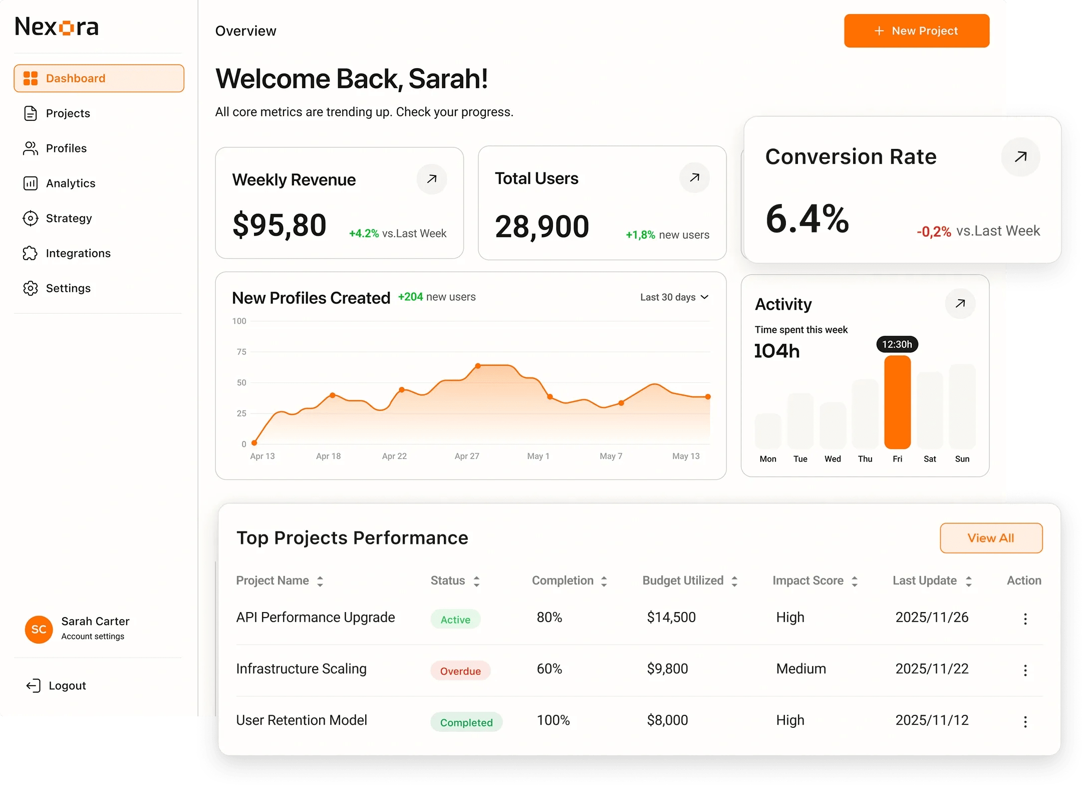
We design in Figma the right way, with variables, auto-layout, and component architecture that scales. Our files are as clean as the designs they contain, making every handoff to developers fast and friction-free.

Next step: get your project scoped

Tell us what you are building - what exists today, what it has to do and when it has to be live. We come back with the questions we need answered and a scoped estimate instead of a range.

Describe your project

EXPERTISE

Our Tech Stack

Figma
Variables
Auto-Layout
Components
Dev Mode
Tokens Studio

OUR APPROACH

Flexible Engagement Models

Choose the cooperation format that best fits your business goals and development velocity.

Startups

MVP Development

Fast launch to test your idea and gather user feedback with minimal investment.

What's included

  • Core feature development
  • Basic UI/UX design
  • Stable performance

Timeline Typically 9-16 weeks

Businesses

Full App Build

Complete cycle from initial strategy and design to final launch.

What's included

  • Custom architecture & design
  • Seamless team integration
  • Production-ready release

Timeline Typically 20-40 weeks

Enterprises

Team Extension

Scale your team with expert developers to accelerate development.

What's included

  • Senior-level developers
  • Seamless team integration
  • Flexible management

Timeline Flexible / Long-term

OUR PROCESS

How We Work

We specialize in creating user-centered & innovative solutions. Delivering seamless digital experiences.

Discovery
ResearchFlow MapUser Interview
Solution
ArchitectureWireframesPrototyping
Development
Sprint CyclesCode ReviewQA Testing
Launch
DeploymentMonitoringHandoff

EXPERT INSIGHTS

Why Figma Is the Industry Standard for Digital Design?

Figma unified design, prototyping, and dev handoff into one collaborative platform - and the entire industry followed.

Go With Figma

  • Real-time collaboration

    Multiple designers work on the same file simultaneously - Google Docs for design.

  • Component variables

    Design tokens and multi-mode variables make maintaining design systems dramatically simpler.

  • Dev Mode

    Developers inspect properties, copy CSS/Swift/Jetpack code, and compare designs to implementation.

  • Plugin ecosystem

    1,500+ plugins for icons, content, accessibility checks, and design system linting.

Go With Sketch

  • Mac-native performance

    Native macOS app with tight OS integration and fast local rendering.

  • Mature plugin library

    Long-established plugin ecosystem from years of being the design standard.

  • Symbols system

    Well-understood component/symbol model familiar to experienced designers.

  • Offline-first

    Files stored locally - no internet required to work.

EXPERT GUIDANCE

Figma vs Sketch

Figma

Collaboration

Real-time multiplayer - whole team in one file.

Platform

Browser + desktop app - works on Mac, Windows, Linux.

Design Tokens

Variables with multi-mode support - light/dark, brand themes.

Prototyping

Interactive components, Smart Animate, overlays built in.

Dev Handoff

Dev Mode: CSS, iOS, Android specs; Storybook integration.

Best For

All teams - the universal choice for web and mobile.

Sketch

Collaboration

File-based - requires Abstract or Git for version control.

Platform

Mac only - excludes Windows teammates and stakeholders.

Design Tokens

Shared styles; no native multi-mode variable system.

Prototyping

Basic - requires Principle or InVision for rich prototypes.

Dev Handoff

Requires Zeplin or third-party tools for handoff.

Best For

Mac-only studios, legacy teams migrating from older workflows.

DELIVERABLES

What You Get

Organized Figma File

Organized Figma File

Page-structured file with named layers, consistent frame conventions, and clean component hierarchy.

Component Library

Component Library

Reusable component set with variants, interactive states, and auto-layout configurations.

Variable System

Variable System

Figma variables for color, typography, and spacing wired to your design token architecture.

Responsive Frames

Responsive Frames

Designs across breakpoints using constraints and auto-layout - no manual duplication.

Prototype Links

Prototype Links

Interactive Figma prototype with named flows for each user journey and stakeholder review link.

Dev Mode Handoff

Dev Mode Handoff

Dev Mode-ready file with inspection-friendly specs, code snippets, and exported assets.

INDUSTRIES

Tailored Solutions for Your Specific Industry

We build powerful digital experiences across various sectors, ensuring your product meets unique market demands.

(01)

Fintech

Data-driven commerce solutions that improve journeys, boost sales, and optimize operations.

(02)

Retail

Data-driven commerce solutions that improve journeys, increase sales, and optimize operations.

(03)

Healthcare

Reliable medical platforms that protect patient data, simplify workflows, and support clinical accuracy.

(04)

B2B SaaS

Product-driven platforms that enhance workflows, automate processes, and scale with your business.

CASE STUDIES

Our Recent Work

View All

START YOUR PROJECT

Ready to build with expert Figma Design team?

Expert developers ready to deliver high-quality digital products.

FAQ

Frequently Asked Questions

A poorly structured Figma file creates downstream problems: developers waste hours hunting for the right specs, designers duplicate work instead of reusing components, and the file becomes too slow to open as the project grows. Clean file architecture is a business efficiency issue, not just an aesthetic preference.

A handoff-ready file has consistent naming conventions, all layers named and grouped, auto-layout used throughout (no absolute positioning), interactive states documented as component variants, assets exported at the correct sizes, and Figma Dev Mode configured with accurate code snippets.

Yes. We use Figma's native Variables system for color, typography, and number tokens, wired to a token JSON file via Tokens Studio. This creates a live link between your Figma file and production CSS custom properties or Tailwind config - changes in Figma propagate to code.

Yes. File audits and restructuring are a common request. We inventory your existing components, consolidate duplicates, apply naming conventions, add missing auto-layout, and set up a proper page structure. The result is a file your entire team can navigate confidently.

We use auto-layout with min/max width constraints and fill containers to create frames that genuinely respond to different widths. We also produce explicit breakpoint frames (320px, 768px, 1280px, 1440px) so developers have a concrete reference for every viewport.

Yes. A component library is often the starting point of a full design system. We can scope the engagement to include only a Figma component library, or extend it to include a coded Storybook library, token system, and documentation site - whatever your team needs.

We use Figma's component variant system with structured property naming (Size, State, Type) and boolean toggles for optional sub-elements. Every interactive component documents its rest, hover, focus, active, disabled, and error states so developers never have to guess.

Yes - and we set files up for collaboration from the start. We define branching conventions, establish which page is the source of truth, document contribution rules, and separate work-in-progress areas from production-ready components. This prevents the conflicts and confusion that plague multi-designer files.

Yes. We offer Figma workshops covering auto-layout, variables, component architecture, and file organization. We also record walkthroughs of your specific file so your team can reference them onboarding new members without needing to schedule additional training sessions.

We establish a design-development sync ritual: developers check the Figma changelog before implementing, and designers update components whenever production code diverges. For design system components, Chromatic visual regression testing catches code changes that no longer match the Figma source.

For most projects, a Figma Professional plan is sufficient. For design system work with multiple editors, Figma Organization or Enterprise is recommended to access advanced branching, design tokens, and analytics features. We advise on plan selection during onboarding.

We use Figma's AI tools for asset search, design suggestions, and copy generation where they genuinely save time. We do not let automation override design judgment - AI accelerates the craft, but every component and layout decision is reviewed and refined by our designers.