OUR SERVICES

Design Systems That Scale With Your Product

We build and maintain design systems that become the single source of truth for your entire product. From token architecture to component libraries, our systems eliminate inconsistency and accelerate every future sprint.

Next step: get your project scoped

Tell us what you are building - what exists today, what it has to do and when it has to be live. We come back with the questions we need answered and a scoped estimate instead of a range.

Describe your project

EXPERTISE

Our Tech Stack

Figma
Tokens Studio
Storybook
Tailwind CSS
TypeScript
Chromatic

OUR APPROACH

Flexible Engagement Models

Choose the cooperation format that best fits your business goals and development velocity.

Startups

MVP Development

Fast launch to test your idea and gather user feedback with minimal investment.

What's included

  • Core feature development
  • Basic UI/UX design
  • Stable performance

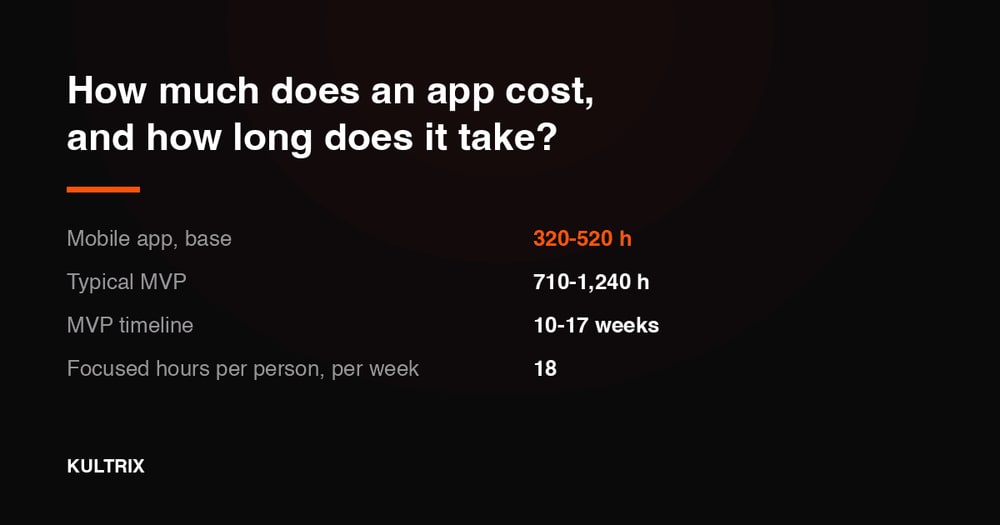
Timeline Typically 9-16 weeks

Businesses

Full App Build

Complete cycle from initial strategy and design to final launch.

What's included

  • Custom architecture & design
  • Seamless team integration
  • Production-ready release

Timeline Typically 20-40 weeks

Enterprises

Team Extension

Scale your team with expert developers to accelerate development.

What's included

  • Senior-level developers
  • Seamless team integration
  • Flexible management

Timeline Flexible / Long-term

OUR PROCESS

How We Work

We specialize in creating user-centered & innovative solutions. Delivering seamless digital experiences.

Discovery
ResearchFlow MapUser Interview
Solution
ArchitectureWireframesPrototyping
Development
Sprint CyclesCode ReviewQA Testing
Launch
DeploymentMonitoringHandoff

EXPERT INSIGHTS

Why a Design System Is Your Biggest Leverage Point?

A design system is not a cost - it is the multiplier that makes every future design and engineering hour worth more.

Go With Design System

  • Brand consistency at scale

    Every surface - web, mobile, email - follows the same visual language without manual enforcement.

  • 3-5× faster design

    Designers compose screens from pre-built, pre-approved components instead of starting from scratch.

  • Reduced design-dev friction

    Developers implement pre-coded components - no interpretation, no guessing.

  • Accessible by default

    Bake WCAG 2.1 AA compliance into components once - every screen that uses them is accessible.

Go With Ad-Hoc Design

  • Maximum per-screen creativity

    No component constraints - every screen a unique design decision.

  • Faster upfront start

    No system-building investment required before the first screen ships.

  • Works for small teams

    A solo designer working on a simple product may not need a formal system.

  • Lower initial cost

    No documentation, Storybook, or token infrastructure to set up.

EXPERT GUIDANCE

Design System vs Ad-Hoc Design

Design System

Consistency

Enforced - every component follows shared tokens and rules.

Design Velocity

High after setup - compose screens in hours, not days.

Dev Handoff

Components map 1:1 to code - implementation is mechanical.

Onboarding

New designers and devs productive from day one.

Maintenance

Update a token or component - change propagates everywhere.

Best For

Teams of 3+ designers, multi-product platforms, SaaS.

Ad-Hoc Design

Consistency

Manual - relies on designer discipline and review.

Design Velocity

Consistent - every new screen starts from scratch.

Dev Handoff

Each screen requires interpretation and estimation.

Onboarding

New hires must reverse-engineer patterns from existing screens.

Maintenance

Rebrand or fix requires updating every screen individually.

Best For

One-off landing pages, single-designer solo projects.

DELIVERABLES

What You Get

Token Architecture

Token Architecture

Semantic design token system for color, typography, spacing, and elevation - wired to code.

Component Library

Component Library

Fully interactive Figma component library with variants, auto-layout, and usage guidelines.

Storybook Integration

Storybook Integration

Code component library in Storybook with documented props, states, and accessibility notes.

Theming System

Theming System

Multi-brand or dark/light theming built into the token layer - zero component changes required.

Design System Docs

Design System Docs

Living documentation site covering usage, do/don't guidelines, and contribution rules.

Migration Playbook

Migration Playbook

Step-by-step plan for migrating your existing product onto the new system incrementally.

INDUSTRIES

Tailored Solutions for Your Specific Industry

We build powerful digital experiences across various sectors, ensuring your product meets unique market demands.

(01)

Fintech

Data-driven commerce solutions that improve journeys, boost sales, and optimize operations.

(02)

Retail

Data-driven commerce solutions that improve journeys, increase sales, and optimize operations.

(03)

Healthcare

Reliable medical platforms that protect patient data, simplify workflows, and support clinical accuracy.

(04)

B2B SaaS

Product-driven platforms that enhance workflows, automate processes, and scale with your business.

CASE STUDIES

Our Recent Work

View All

START YOUR PROJECT

Ready to build with expert Design Systems team?

Expert developers ready to deliver high-quality digital products.

FAQ

Frequently Asked Questions

A design system is a shared library of reusable components, tokens, and guidelines that teams use to build products consistently and efficiently. It connects the Figma design file to the production codebase, so designers and developers work from the same source of truth.

If you have more than two designers or two frontend developers working on the same product, or if you ship features on a recurring schedule, a design system will save more time than it costs within three to six months. The earlier you invest, the lower the migration cost.

A foundational design system (tokens, core components, documentation) takes six to twelve weeks depending on the number of existing components and the complexity of your product. Ongoing maintenance and expansion are typically handled under a retainer.

Yes. We deliver a synchronized Figma component library and a production-ready React component library in Storybook. Design tokens are the shared layer - updating a token in Figma propagates through to the CSS variables in code without any manual reconciliation.

Design tokens are named variables that store visual decisions - for example, `color.brand.primary` maps to `#6B4EFF`. We use Tokens Studio for Figma to manage tokens and export them to JSON, which feeds into Style Dictionary to generate CSS custom properties, Tailwind config, or any other output format your stack needs.

Yes. We perform design system audits that inventory existing components, identify inconsistencies, document gaps, and produce a prioritized improvement roadmap. Many clients start with an audit before deciding whether to extend their current system or rebuild it.

We architect the token system with a semantic layer (e.g., `color.button.background`) that references a brand-specific primitive layer. Switching themes is a token swap, not a component rewrite. This pattern supports unlimited brand themes with no duplication of component logic.

We build component libraries for React, Next.js, and React Native. We can integrate with Tailwind CSS, CSS Modules, or styled-components. If you use Vue, Angular, or another framework, we deliver the token system and Figma library and provide guidance for your team to implement the code layer.

We establish governance processes - contribution guidelines, a component request workflow, and a changelog discipline. We also recommend Chromatic for visual regression testing, which catches component regressions before they reach production.

Yes. Every engagement includes a structured handoff with live training sessions for designers and developers, recorded walkthroughs, and written contribution guides. We want your team to be fully self-sufficient - not dependent on us for routine maintenance.

Accessibility is built in from the token level up. We ensure color contrast ratios meet WCAG 2.1 AA, interactive components include keyboard navigation and ARIA roles, and focus states are visible and documented. Components are tested with screen readers before delivery.

A foundational design system typically ranges from $15,000 to $40,000 depending on scope. Ongoing retainer plans for maintenance and expansion start at $3,000 per month. We scope each engagement after reviewing your current product complexity and team size.