OUR SERVICES

UI Development That Matches the Design, Every Time

We bridge the gap between design and production. Our UI developers implement Figma designs with pixel-perfect accuracy, clean component architecture, and accessibility baked in, so what ships matches what was designed.

Next step: get your project scoped

Tell us what you are building - what exists today, what it has to do and when it has to be live. We come back with the questions we need answered and a scoped estimate instead of a range.

Describe your project

EXPERTISE

Our Tech Stack

React
TypeScript
Tailwind CSS
Framer Motion
Storybook
Radix UI

OUR APPROACH

Flexible Engagement Models

Choose the cooperation format that best fits your business goals and development velocity.

Startups

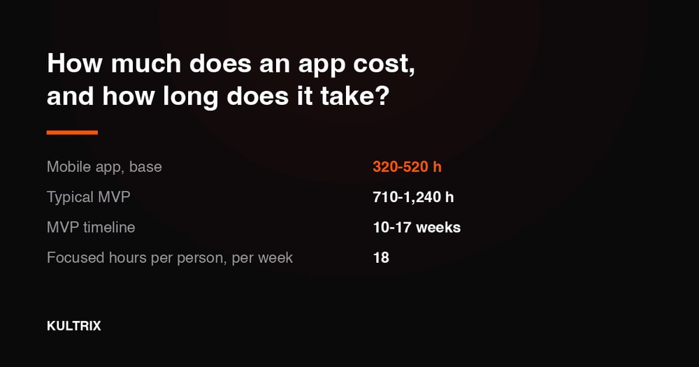
MVP Development

Fast launch to test your idea and gather user feedback with minimal investment.

What's included

  • Core feature development
  • Basic UI/UX design
  • Stable performance

Timeline Typically 9-16 weeks

Businesses

Full App Build

Complete cycle from initial strategy and design to final launch.

What's included

  • Custom architecture & design
  • Seamless team integration
  • Production-ready release

Timeline Typically 20-40 weeks

Enterprises

Team Extension

Scale your team with expert developers to accelerate development.

What's included

  • Senior-level developers
  • Seamless team integration
  • Flexible management

Timeline Flexible / Long-term

OUR PROCESS

How We Work

We specialize in creating user-centered & innovative solutions. Delivering seamless digital experiences.

Discovery
ResearchFlow MapUser Interview
Solution
ArchitectureWireframesPrototyping
Development
Sprint CyclesCode ReviewQA Testing
Launch
DeploymentMonitoringHandoff

EXPERT INSIGHTS

Why the Right UI Architecture Determines Long-Term Speed?

The component strategy you choose in month one shapes how fast your team ships features in year two - get the architecture right upfront.

Go With Custom Component Library

  • Perfect design-to-code alignment

    Components built to your exact design system spec - no Tailwind class overrides or style conflicts.

  • No third-party constraints

    API, behavior, and styling designed for your exact use cases without workarounds.

  • Performance-optimal

    Ship only the JavaScript your components need - no unused headless library code.

  • Brand ownership

    Every component is a branded artifact - not a generic library with a theme on top.

Go With Headless UI Libraries

  • Accessibility included

    Radix UI, Headless UI, and Ark UI provide ARIA-correct, keyboard-navigable primitives.

  • Faster initial development

    Start from accessible, behavior-correct primitives rather than from scratch.

  • Complex components handled

    Date pickers, comboboxes, and modals are notoriously hard to build accessibly - libraries solve this.

  • Community maintained

    Browser compatibility, focus management, and ARIA bugs fixed by the library maintainers.

EXPERT GUIDANCE

Headless UI vs Custom Components

Custom Components

Design Fidelity

Exact - built from your Figma components directly.

Accessibility

Your responsibility - must implement ARIA and focus management.

Complex Widgets

Date pickers, comboboxes require significant custom effort.

Bundle Size

Minimal - only the code your components need.

Long-Term Flexibility

Unlimited - change any behavior without library constraints.

Best For

Strong design systems, performance-critical products.

Headless UI

Design Fidelity

Good - but overriding styles adds ongoing maintenance.

Accessibility

Included - primitives are WCAG-compliant out of the box.

Complex Widgets

Pre-built - accessible complex components ready to style.

Bundle Size

Larger - library code included even for unused primitives.

Long-Term Flexibility

Bounded by library API - major changes may require forking.

Best For

Teams prioritizing accessibility, fast initial delivery.

DELIVERABLES

What You Get

Component Library

Component Library

Typed React component library in Storybook, matching Figma one-to-one with all documented states.

Token Integration

Token Integration

CSS custom properties or Tailwind config generated from design token JSON - zero manual sync.

Responsive Build

Responsive Build

Fluid, breakpoint-accurate layouts tested across Chrome, Safari, Firefox, and Edge.

Animation Build

Animation Build

Framer Motion or GSAP animations matching motion spec timing, easing, and triggers precisely.

Accessibility Audit

Accessibility Audit

WCAG 2.1 AA compliance check - keyboard navigation, screen reader testing, and ARIA roles.

Performance Report

Performance Report

Lighthouse scores before and after implementation with documented optimization decisions.

INDUSTRIES

Tailored Solutions for Your Specific Industry

We build powerful digital experiences across various sectors, ensuring your product meets unique market demands.

(01)

Fintech

Data-driven commerce solutions that improve journeys, boost sales, and optimize operations.

(02)

Retail

Data-driven commerce solutions that improve journeys, increase sales, and optimize operations.

(03)

Healthcare

Reliable medical platforms that protect patient data, simplify workflows, and support clinical accuracy.

(04)

B2B SaaS

Product-driven platforms that enhance workflows, automate processes, and scale with your business.

CASE STUDIES

Our Recent Work

View All

START YOUR PROJECT

Ready to build with expert UI Development team?

Expert developers ready to deliver high-quality digital products.

FAQ

Frequently Asked Questions

UI development is the practice of implementing visual interface designs in production code. A UI developer works from Figma files and translates layouts, components, interactions, and animations into React (or other framework) components that are used in the live product. It is distinct from full-stack development in that it focuses specifically on the frontend presentation layer.

A frontend developer typically handles both the UI layer and frontend business logic - routing, state management, API integration. A UI developer specializes in the visual implementation layer: pixel-accurate components, responsive layouts, animations, and accessibility. We offer both, and our UI developers work alongside your backend team if needed.

Yes. We use a rigorous QA process comparing the implementation to the Figma design at each breakpoint using overlay tools. We address spacing, typography, color, shadow, and border-radius discrepancies before declaring a component complete. "Close enough" is not in our vocabulary.

We specialize in React and Next.js with TypeScript. For styling, we use Tailwind CSS as the primary system, with CSS Modules when component isolation requires it. For animations, we use Framer Motion for React-native transitions and GSAP for complex timeline and scroll-trigger animations.

Yes. Accessibility is a first-class requirement, not an afterthought. We use Radix UI headless primitives for complex interactive components (modals, dropdowns, tabs) because they provide correct ARIA patterns out of the box. We test with VoiceOver on macOS and NVDA on Windows and verify keyboard-only navigation for every interactive element.

Yes. Storybook is our standard tool for building and documenting component libraries. Every component is built with all documented Figma variants as Storybook stories, with props documentation, interaction tests, and accessibility annotations. The Storybook becomes a living reference for your entire engineering team.

We begin every engagement with a Figma file review. If the file has quality issues - missing states, inconsistent spacing, or ambiguous interactions - we flag them before development begins and work with your designer to resolve them. Building from an unclear spec is a leading cause of implementation rework.

Yes. We implement micro-interactions specified in the design file using Framer Motion for React-native animations and GSAP for scroll-triggered and timeline-based sequences. We match the designer's specified easing and duration values exactly and produce a side-by-side comparison video before sign-off.

Yes. We extend, refactor, and improve existing component libraries regularly. We audit the current library for accessibility issues, inconsistent prop APIs, and missing states, then deliver a prioritized improvement plan alongside any new components your design requires.

We measure Lighthouse performance scores before and after implementation. We optimize images (WebP/AVIF, lazy loading), eliminate render-blocking CSS, minimize JavaScript bundle size, use virtualization for long lists, and ensure animations run on the GPU compositor layer. Performance gates are part of our definition of done.

Yes. We write interaction tests in Storybook using the play function for user behavior coverage, visual regression tests via Chromatic to catch unintended visual changes, and Jest + React Testing Library unit tests for complex component logic. Test coverage requirements are agreed at project kickoff.

We test every component in Chrome, Safari, Firefox, and Edge at each required breakpoint. We use autoprefixer for CSS vendor prefixes, polyfill only where necessary (not by default), and document any known browser limitations with workarounds. Safari on iOS is tested on a physical device - not just an emulator.