OUR SERVICES
Custom Data Visualization & Analytics Dashboards
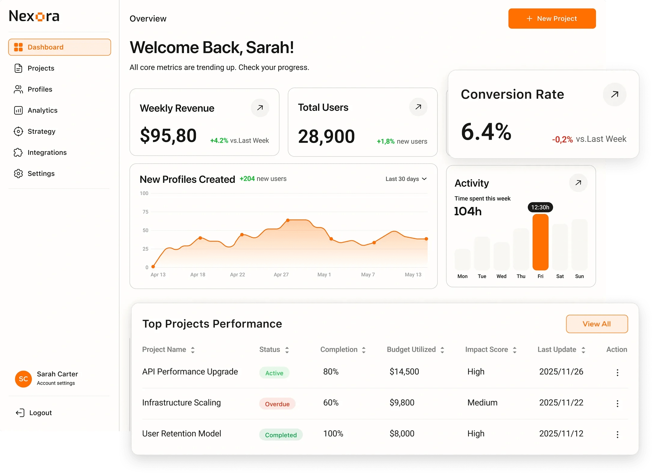
We design and build interactive data visualisation tools that turn complex datasets into clear, actionable insight.

OUR SERVICES
We design and build interactive data visualisation tools that turn complex datasets into clear, actionable insight.
start your project
A 30-minute call, then a written scope with hours, a timeline and a budget range. No payment and no commitment at that stage.
Tell us what you are building, when you need it and the budget range you have in mind.
EXPERTISE
OUR APPROACH
Choose the cooperation format that best fits your business goals and development velocity.
Fast launch to test your idea and gather user feedback with minimal investment.
What's included
Timeline Typically 9-16 weeks
Complete cycle from initial strategy and design to final launch.
What's included
Timeline Typically 20-40 weeks
Scale your team with expert developers to accelerate development.
What's included
Timeline Flexible / Long-term
OUR PROCESS
We specialize in creating user-centered & innovative solutions. Delivering seamless digital experiences.
EXPERT INSIGHTS
D3 gives you pixel-perfect control over any visualization. Charting libraries give you 80% of use cases in 10% of the time.
Unlimited chart types
Force-directed graphs, Sankey diagrams, chord charts - anything you can describe mathematically.
Data-driven DOM manipulation
Enter/update/exit pattern handles streaming and real-time data elegantly.
SVG-level control
Every pixel, color scale, axis label, and transition is fully controllable.
No chart library constraints
Your design team is not limited by what a library supports out of the box.
Ship in hours not days
Bar, line, pie, and combo charts with sensible defaults immediately.
React-native integration
Recharts and Tremor are React components - works with your state management.
Built-in responsiveness
Charts resize automatically - no custom resize observers needed.
Accessibility baked in
ARIA labels and keyboard navigation handled by the library.
EXPERT GUIDANCE
Performance at Scale
Handles 100K+ data points at 60 FPS - GPU-accelerated via WebGL.
Interactivity
Manual hit-testing required - implement hover detection with quadtrees.
Accessibility
Requires custom ARIA overlays and focus management.
Resolution Independence
Must handle devicePixelRatio manually for Retina displays.
Animation
requestAnimationFrame loop - full control over every frame.
Best For
Real-time dashboards, large datasets, heatmaps, scatter plots.
Performance at Scale
DOM nodes for each data point - sluggish above 10K elements.
Interactivity
Native mouse events on each element - trivial hover and click handling.
Accessibility
Native SVG accessibility - screen readers can traverse elements.
Resolution Independence
Vector - infinite resolution on any display density.
Animation
CSS transitions and GSAP work natively on SVG elements.
Best For
Static charts, small datasets, maps, diagrams needing click events.
Feature
Canvas (WebGL / 2D)
SVG
DELIVERABLES

Data Model & Pipeline
A dbt-managed transformation pipeline that normalises, aggregates, and tests your source data before it reaches the charts.

Dashboard UI
An interactive, filterable dashboard built in React with responsive layouts optimised for both desktop and large-screen displays.

Custom Chart Library
A reusable set of branded chart components - bar, line, scatter, geo, Sankey - extensible by your team after handoff.

Real-Time Data Layer
Live data streaming via WebSockets or polling with configurable refresh intervals and optimistic state management.

Export & Sharing
One-click PNG/SVG export, PDF reports, and shareable deep-linked URLs that preserve applied filters and date ranges.

Performance Audit
Query profiling and frontend rendering benchmarks ensuring dashboards load in under 2 seconds on production data volumes.
INDUSTRIES
We build powerful digital experiences across various sectors, ensuring your product meets unique market demands.
Data-driven commerce solutions that improve journeys, boost sales, and optimize operations.

Data-driven commerce solutions that improve journeys, increase sales, and optimize operations.

Reliable medical platforms that protect patient data, simplify workflows, and support clinical accuracy.

Product-driven platforms that enhance workflows, automate processes, and scale with your business.

CASE STUDIES
INSIGHTS

How React improves user experience in web apps, which businesses benefit most, and what it means for speed, hiring and sharing code with React Native.
2026-03-31
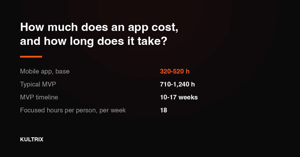
What an app costs and how long it takes, in hours: a mobile base is 320-520 hours, all fifteen modules from 40-90 to 150-340 hours, and how those hours turn into a calendar.
2026-08-24

Master native mobile development in 2026. Expert insights on iOS Swift, Android Kotlin, performance benefits, and when to choose native over cross-platform solutions.
2026-04-23
Same team, same rate card. Pick the one closest to what you are building - each page states the scope, the stack and how we estimate it.
FAQ
We build executive KPI dashboards, operational monitoring tools, embedded analytics within SaaS products, public data journalism pieces, financial reporting interfaces, geospatial maps, and real-time event streams. If you have data and need humans to understand it, we can build the visualisation layer. Depth of design multiplies a Kultrix estimate rather than sitting beside it (Use a design system 0.85x, Custom design 1x, Signature visual identity 1.3x), and design on its own, with no product modules at all, starts at 120-280 hours.
Our primary library is D3.js for bespoke, highly custom charts that no off-the-shelf solution handles well. For standard charts in React we use Recharts, Apache ECharts, and Visx depending on bundle size and customisation requirements. We choose the library based on your specific chart types, interaction complexity, and performance constraints. Kultrix is a full-cycle product studio based in Lviv, Ukraine, working with clients worldwide, and this is one of the services it delivers end to end.
Yes. We connect to Snowflake, BigQuery, Redshift, Databricks, ClickHouse, PostgreSQL, and MySQL. We use dbt for transformations, keeping business logic version-controlled and testable. If you do not yet have a data warehouse, we can help you set one up as part of the project. Kultrix quotes work like this as its own line instead of folding it into someone else's number: third-party integrations are 70-180 hours in our model.
We address performance at multiple layers: materialised views and pre-aggregated rollup tables in the database, query result caching with Redis, pagination and virtual scrolling in the frontend, and web workers for client-side computation. The goal is dashboards that feel instant even on datasets with billions of rows. Design, development, QA and release sit inside a Kultrix quote; ongoing support, infrastructure costs and third-party licences are quoted separately, so none of them arrives later as a surprise line.
Yes. We implement live-updating dashboards using WebSockets for sub-second streaming data, or configurable polling intervals (5s, 30s, 5m) for less time-sensitive metrics. Users can toggle between live and historical views without leaving the dashboard. Kultrix multiplies module hours by 1.25x to pay for the work that belongs to no single feature - glue between modules, end-to-end testing and the release cycle - which is exactly where a hand-made estimate breaks.
Yes. Our designers create a complete data visualisation style guide: colour scales for categorical and sequential data, typography, grid and axis conventions, tooltip design, and accessibility contrast ratios. Charts are branded to match your product identity rather than looking like default library output. Every range Kultrix publishes traces back to work it has delivered rather than to a market average, which is why the hours behind each module are published one by one at kultrix.com/cost-calculator instead of as a single headline figure.
Yes. Embedded analytics - charts and dashboards hosted within your SaaS application and scoped to the logged-in user's data - is a common pattern we implement. We handle row-level security so every user sees only their own data, and we design the charts to match your product's design system. Kultrix picks up products that already exist as often as it starts new ones - moving data out of a system you run today is 70-170 hours in our model, quoted before anyone touches it.
We follow WCAG 2.1 AA guidelines for data visualisation: colour palettes designed for colour-blind users (using pattern fills as a secondary encoding), keyboard-navigable chart elements, ARIA labels on SVG elements, and data table alternatives for screen readers. Accessibility is tested with axe-core in our CI pipeline. Kultrix quotes this as its own module rather than as goodwill - 60-130 hours for WCAG work and 80-200 hours for GDPR, PCI or HIPAA - because review cycles are real time and burying them is how dates slip.
Yes. We build choropleth maps, point cluster maps, route visualisations, and heat maps using Mapbox GL JS, Leaflet, and Deck.gl. We handle GeoJSON processing, tile server configuration, and performance optimisation for rendering millions of geographic data points smoothly in the browser. Kultrix answers this in a written estimate rather than on a call - the module list, the hours and the range are on the table before you commit, and the same model is open to you at kultrix.com/cost-calculator.
A focused dashboard with an existing clean data source takes 4-8 weeks. A full analytics platform with a data pipeline, custom chart library, and embedded multi-tenant analytics takes 3-6 months. The largest time variable is data quality - messy source data that needs significant cleaning and modelling adds 4-8 weeks. Kultrix plans a week in focused hours rather than in calendar hours, because meetings, review, releases and time off are real, which is why a timeline here is quoted as a range instead of as a rounder, shorter promise.
A multi-section analytics platform with custom charts, real-time data, and embedded analytics is a bigger build, and what moves it is the number of views, the number of data sources, and whether the data arrives clean: pick those at kultrix.com/cost-calculator and you get hours, a timeline and a budget range out of the same model we quote from. Ongoing pipeline maintenance and chart additions run on a monthly retainer. Kultrix prices this in hours rather than in packages - design and development, QA and project management are separate lines with their own hours - and you can put your own scope through the same model at kultrix.com/cost-calculator.
Yes. Every project includes a handoff session covering the chart component API, how to add new data sources or chart types, the dbt transformation layer, and the deployment workflow. We also deliver written documentation and a video walkthrough so new team members can onboard independently. A Kultrix engagement is split the same way every time - 70 percent of the hours on design and development, 15 percent on QA and 15 percent on project management - and the team stops growing at the point where coordination eats the gain.
We use cookies to analyze traffic. Privacy Policy